Case study 05 of 06
Rialto
Rialto asks timeshare owners to list their properties for rent. The email has one job, getting owners to the List Your Timeshare button, and it has to do that job equally well on a laptop and a phone.
- Brand
- Rialto
- Industry
- Travel / Hospitality
- Discipline
- Responsive email design & development
- Scope
- Acquisition email, desktop and mobile
Overview
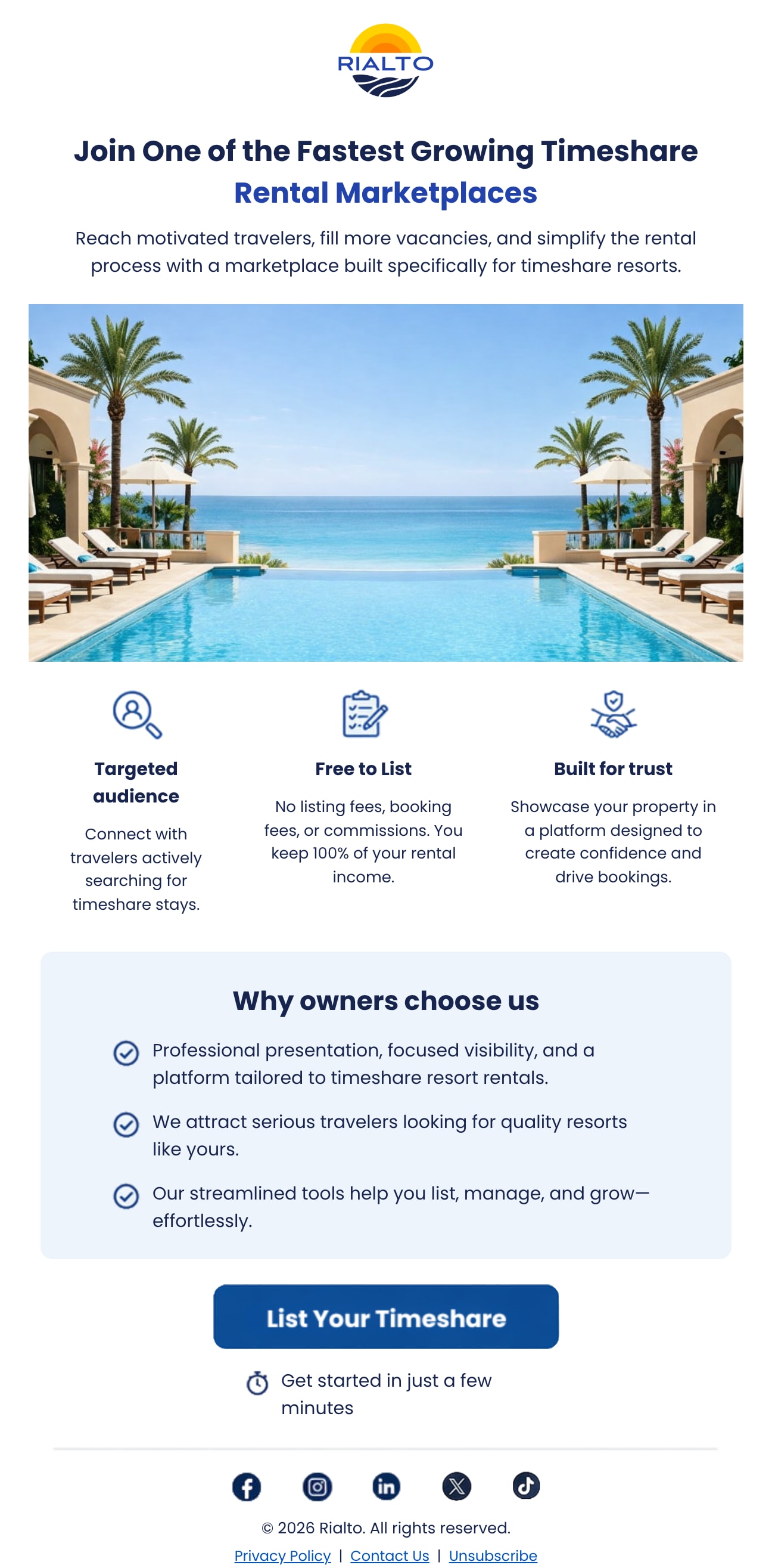
Rialto is a rental marketplace built for timeshare resorts. This email speaks to owners: a resort hero, three reasons to list, a short proof panel and a single call to action.
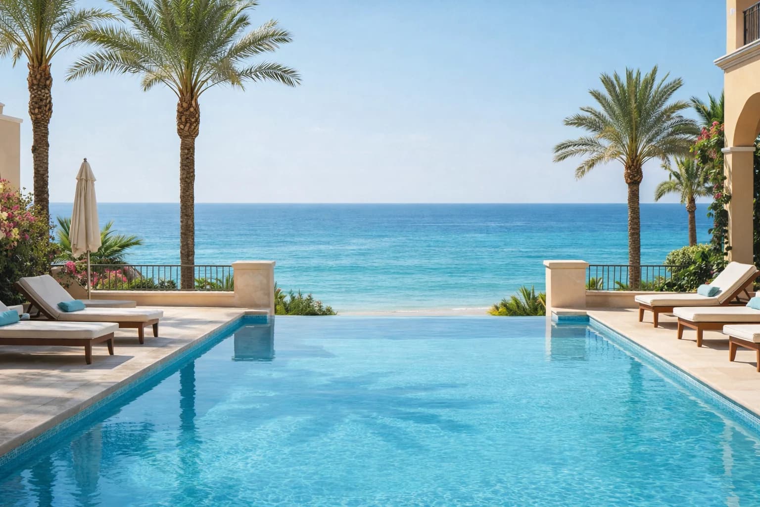
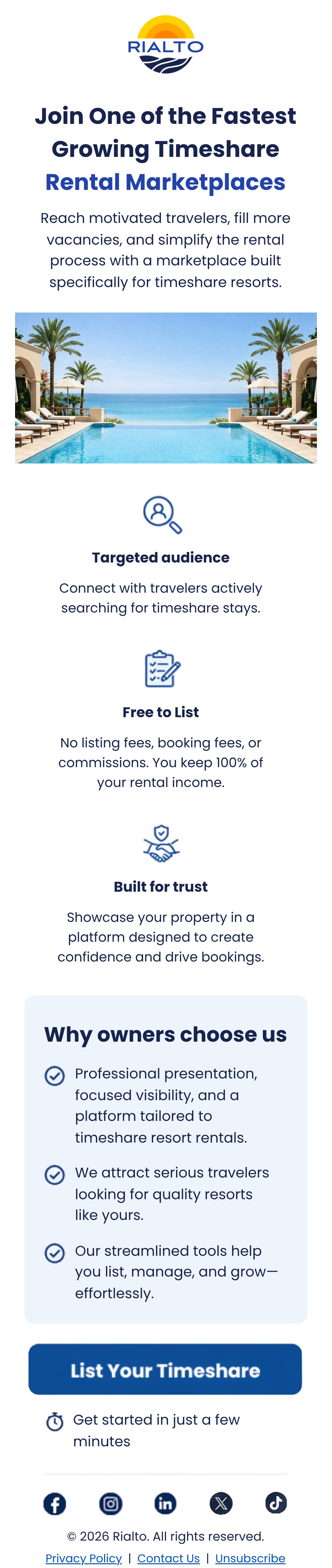
The headline and intro are live HTML above a text-free resort photograph, so the message stays sharp, readable and accessible in every client, even with images off. At the mobile breakpoint the build swaps in a stacked version of the feature row and enlarges type and spacing for a thumb, rather than shrinking the desktop layout.
Technical scope
Two layouts, one file
Desktop and mobile versions of the hero image and feature row live in the same HTML, toggled with hide and mobile-only classes inside a 767px media query.
Outlook-safe structure
Table-based layout with MSO conditional comments, and mobile-only blocks wrapped so Outlook on Windows never renders them.
Utility-class framework
Mobile spacing and type adjustments come from a small set of utility classes, such as pl20 and fsz14, applied inside the media query so overrides stay predictable.
Live text and retina assets
Headline and copy are real text in the brand's geometric sans with system fallbacks. The hero photo and button are supplied at 2x and sized with width attributes, and every content image carries alt text.
Side by side
The same HTML at desktop and mobile widths. Scroll inside each frame to read the whole email.
Desktop
Up close
Message first, photo second
The promise is set as live text above the photograph rather than baked into it, so it renders crisply, survives images-off views and is read by screen readers.
Excerpt. Select it to zoom; the complete email is shown above.
Sized for a phone
Below 768px the headline steps up in size, the copy reflows to a comfortable measure and the hero runs full width, with no pinch-zooming required.
Excerpt. Select it to zoom; the complete email is shown above.
Answer the next question
A soft blue panel with three checkmarked points sits between the features and the button, handling the owner's doubts before the ask.
Excerpt. Select it to zoom; the complete email is shown above.
Technical considerations
Responsive design
Separate desktop and mobile compositions instead of one layout squeezed to fit, so each screen gets the hierarchy it needs.
Mobile optimization
Larger live type, stacked features and a full-width button sized for touch.
Visual consistency
One palette of navy, bright blue and pale sky, and one icon style, across hero, features, panel and footer.
Technologies and capabilities
- Email design
- Hand-coded HTML/CSS
- Media queries
- MSO conditional comments
- Utility-class framework
- Web fonts with fallbacks
- Accessible alt text

Let’s build something exceptional.
Looking for someone who understands both the technology and the marketing behind great digital experiences? Let’s connect.